

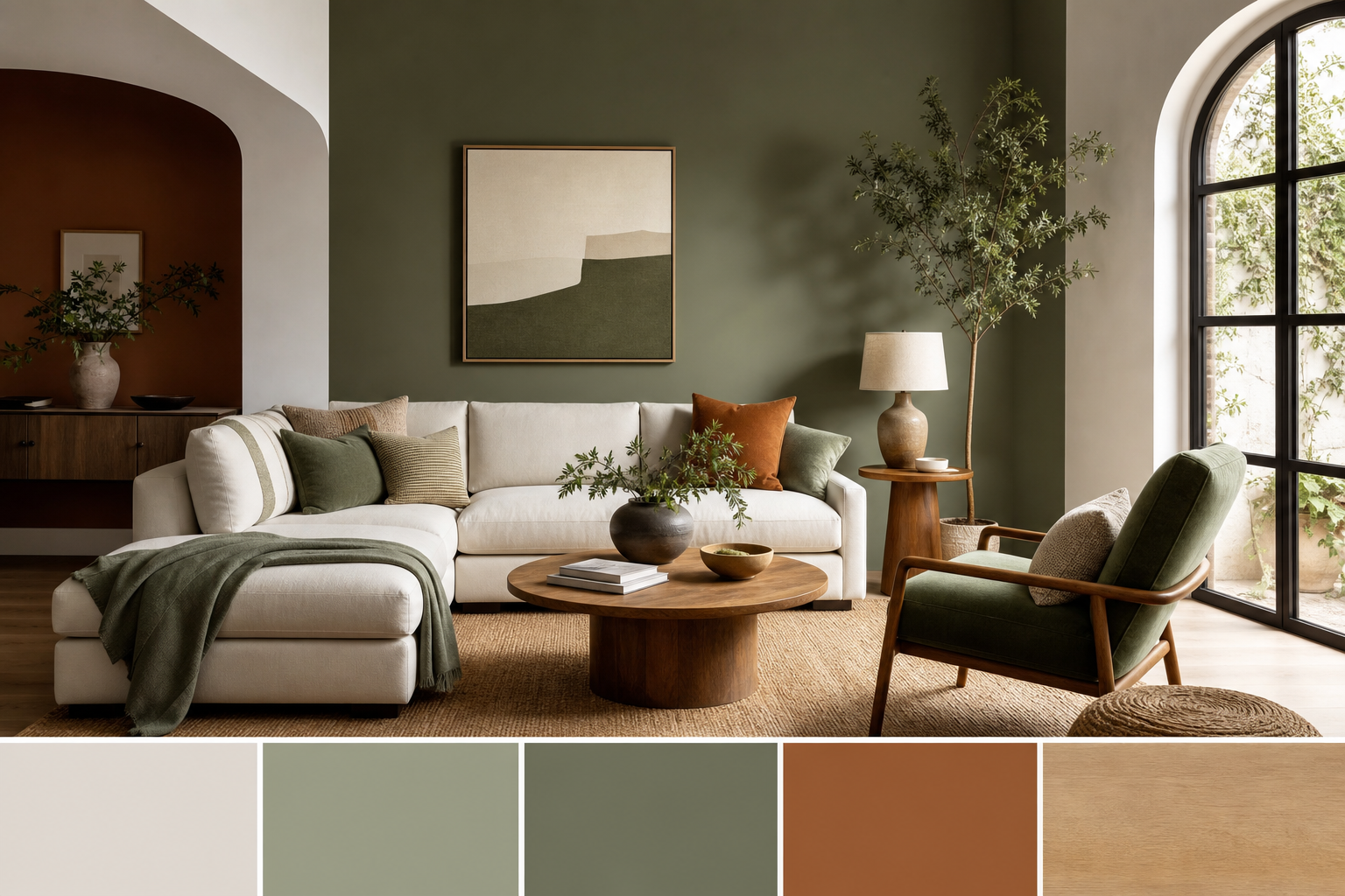
Home decor color palettes: What they are and why they matter
A home decor color palette is the intentional set of colors you use across paint, furniture, textiles, lighting, and accessories to make a room feel cohesive. A clear palette guides purchasing, helps a room read larger or cozier, and keeps styling decisions consistent when you shop for high-end furniture and decor. This article defines the term, explains a few reliable rules designers use, and gives six ready-to-use palettes with hex codes and practical notes so you can shop or visit the showroom with confidence.
What a home decor color palette is and why it matters
A palette groups a dominant color, one or two secondary colors, and one or more accents to manage contrast and mood. A dominant color usually covers about 60 percent of the room, a secondary color about 30 percent, and accent color(s) the remaining 10 percent. The 60-30-10 rule is a common compositional shorthand designers recommend because it produces balanced results in most rooms, and you can read an accessible explanation of that principle here.
Why it matters: a deliberate palette does three practical things. First, it makes buying decisions faster because you can test swatches against a known palette. Second, it controls the room’s emotional temperature so you can make a living room feel calm, dramatic, or airy on purpose. Third, it reduces costly mistakes when ordering large pieces like sofas, dining chairs, or rugs because you match color families before checkout.
Six ready-to-use palettes with hex codes and where they work
Below are six palettes you can use as-is. Each palette lists hex codes, a short mood description, and the rooms where the combination typically works best. Ready palettes remove guesswork and help you pull cohesive samples before buying (examples).
-
Neutral layered palette
Hexes: #F5F5F2, #E6E1D6, #BDB6AA, #7D7265, #2F2B28
Mood: Calm and versatile. Best for living rooms, bedrooms, and open-plan spaces where furniture becomes the focus.
-
Warm earthy palette
Hexes: #F4EEE7, #D9C6B8, #B68B6D, #8B5A3C, #3E2F28
Mood: Cozy and grounded. Ideal for dining rooms, reading nooks, and homes that lean into natural textures. Designers often treat earth tones as layered neutrals to build warmth rather than a single pop color, which creates depth and calm (Vogue).
-
Cool modern palette
Hexes: #F2F8FB, #D9E8EF, #9FB9C9, #4A748C, #1F4256
Mood: Fresh and clean. Works well in kitchens, home offices, and contemporary living rooms.
-
Moody jewel-tone palette
Hexes: #F4F1F6, #BFA6D9, #8A4BB2, #4B2C6F, #1E1530
Mood: Dramatic and luxe. Use in a library, formal living room, or as accent walls and upholstery.
-
Monochrome minimalist palette
Hexes: #FFFFFF, #E5E5E5, #BFBFBF, #7F7F7F, #222222
Mood: Crisp and modern. Best for galleries, modern living rooms, and spaces that rely on contrast and texture instead of color.
-
Coastal light palette
Hexes: #FBFDFD, #E8F7F9, #BEE9F2, #7FC6D6, #3A9BB0
Mood: Airy and relaxed. Best for sunrooms, bathrooms, and coastal or beach-inspired bedrooms.
Simple rules to build or adapt a palette
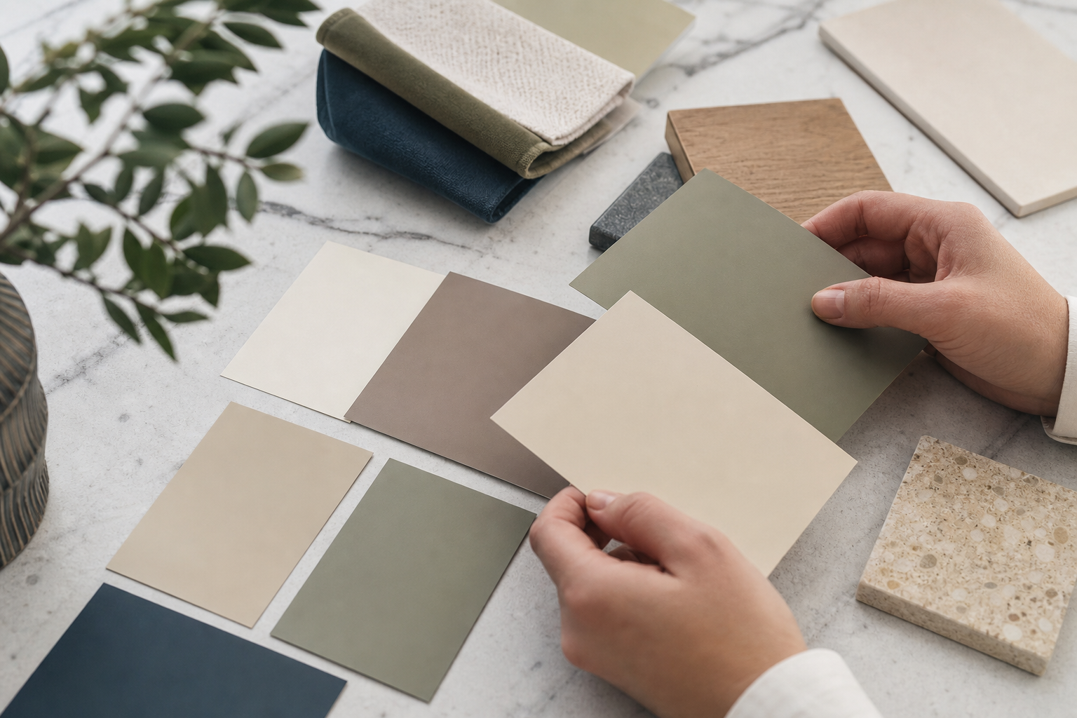
Use these practical methods when you need to create a palette from scratch or adapt one you find online. They are quick to apply when you shop for furniture or compare fabric swatches.
- Start with the 60-30-10 rule, using a neutral as your 60 percent when possible. This rule is a fast way to achieve visual balance and is widely advised for beginners and professionals alike (Wayfair).
- Pick a dominant neutral if you want longevity, or choose a warm or cool dominant for a mood-driven scheme. Neutrals provide flexibility when you add new pieces over time.
- Balance undertones by comparing swatches in natural light. If wood floors read yellow, keep your dominant or secondary color with a complementary undertone so they do not clash.
- Layer earthy tones rather than relying on one brown or tan. Layering related shades creates depth and is a recommended approach for calm interiors (Vogue).
- Adapt around a statement piece by sampling the dominant color family from an existing sofa, rug, or wood floor and using that as your 30 percent or 60 percent anchor, depending on scale.
How to choose a dominant color when you already have furniture or flooring
Follow this quick checklist to decide whether a fixed element should be dominant or secondary.
- List fixed elements that are expensive or hard to change, such as floors, built-ins, or a large sofa.
- Observe natural light at different times of day. Light can warm or cool colors noticeably.
- Consider scale. Large surfaces like floors or sectional sofas usually read best as dominant colors. Smaller upholstered pieces or accent chairs are natural accents.
- Match finish and texture. If a wood finish has heavy red undertones, choose secondary or accent colors that harmonize rather than clash.
How to match AFBDECOR furniture, lighting, and wall decor to a palette
When you have a palette, pick furniture and decor that reinforce its role. AFBDECOR offers modern and contemporary pieces that pair well with the palettes above. For example, the Tina Cane Dining Chair complements warm earthy and neutral layered palettes because its natural cane and dark wood frame read as textural neutrals. See the product details on the Tina Cane Dining Chair product page here.
For lounge applications, the East Lounge Chair (Reproduction) can anchor moody jewel-tone or monochrome palettes, since its leather and walnut veneer finishes provide visual weight. Review the East Lounge Chair (Reproduction) details on its product page here.
Other pairing tips
- Match metal finishes of lamps and mirrors to small accents in the palette. Warm palettes benefit from brass or aged bronze finishes, while cool palettes pair well with nickel or matte black.
- Use textured rugs and pillows in your 30 percent family to add warmth without changing the dominant wall color.
- Anchor a room with one large piece in a secondary color and scatter small accents in the 10 percent accent color for visual pop.
For trend-aware product recommendations and examples of how contemporary silhouettes fit color-led rooms, see AFBDECOR’s discussion of contemporary furniture trends here.
What to expect when you shop with AFBDECOR
AFBDECOR sells modern and contemporary high-end furniture and decor online and supports North American shoppers with free shipping across the USA and Canada, with Warehouse Sale items designated for local pick-up only. The showroom at 6311 Inducon Corporate Dr in Sanborn is open by appointment for in-person viewing and consultation, and Warehouse Sale deals are available for local pick-up only. For full details about ordering, shipping, and showroom visits, see the AFBDECOR website AFBDECOR.
Common mistakes and valid objections, with how to handle them

Buyers often worry that an online photo will not match paint or fabric in their home. That is valid. Screens and studio lighting alter color. Mitigate the risk by ordering physical swatches where possible, testing them in natural light, and trying an anchor piece first such as an ottoman or throw pillow.
Another common mistake is chasing trends without commitment. If you are unsure, use the neutral layered or monochrome palettes until you are ready to introduce bolder accents. When dealing with undertones, compare swatches against existing wood and metal finishes before committing to wall or upholstery colors.
A short checklist to use before you buy
- Confirm swatches in the room at morning and evening light.
- Measure scale so large furniture fits the proportion of the room.
- Apply the 60-30-10 distribution to your chosen palette and label which items fill each percentage.
- Note fixed elements like floors and trim and decide their role in the palette.
- Test a small upholstered item or pillow in the palette before ordering a major piece.
Next steps and a short local shopping call to action
If you want to see finishes and textiles in person, book an appointment at the Sanborn showroom to compare swatches and preview pieces before you buy. You can also browse AFBDECOR New Arrivals and Best Sellers online to match pieces to your chosen palette and take advantage of free shipping across the USA and Canada for qualifying items. For showroom inspiration on current silhouettes, review ideas about contemporary furniture trends on the AFBDECOR blog here.
Frequently asked questions
How do I test color accuracy for paint and fabric before I commit?
Order physical paint strips or fabric swatches and place them in the room at different times of day. View them near the furniture pieces you plan to keep so you can judge undertones and light interactions accurately.
Which palette should I choose if I have a dark wood floor and neutral furniture?
Use a neutral layered or warm earthy palette and let the floor read as either the dominant 60 percent or a strong secondary 30 percent depending on its visual scale. Layer lighter neutrals above it to keep the room from feeling heavy.
How strictly should I follow the 60-30-10 rule when styling a living room?
Use the rule as a flexible guideline rather than a strict formula. It helps create balance quickly. If a dominant piece must be different for practical reasons, adjust the percentages so the visual weight still feels balanced.
Can I match AFBDECOR furniture to an existing palette if the product photos use studio lighting?
Yes, but verify finishes with swatches or an appointment. Product pages include material and dimension information that helps with selection, and you can view samples in person by scheduling a showroom visit to confirm color and texture.
What should I bring to an AFBDECOR showroom appointment to make the most of my visit?
Bring photographed swatches of your wall color, a small sample of flooring if possible, and photos of the room from different angles. Measure doorways and the room to confirm scale, and bring a shortlist of pieces you want to compare.
Ready to match your room to a confident palette and quality pieces? Visit AFBDECOR to browse collections or book an appointment at the Sanborn showroom for hands-on swatch comparisons and product viewing.